Refurbished Gmail
Interfaces embedded with a novel concept
PREMISE
Prototyping for a digital interface that is not dependent upon legacy conventions, but rather is rooted in the affordances of digital media and screen displays.
THE DESIGN CHALLENGE
Prototyping for the visual design of an information-rich website interface that presents a cohesive and unified user experience by deriving its conventions from one core formal concept.
Key challenges:Relate all typographic treatments, armature styling,* and active states to one another according to a core formal concept (i.e., achieve internal consistency).Deviate from conventional signaling of hierarchy in typography in at least one significant way.Deviate from conventional organization of content in at least one significant way.
Concept
Core concept: TREE as a Timeline
UI concept: Card Slider
Behavior: Cards structured in a way where newer growth appears on top.
Visual: Timeline appears in the middle of all the cards connecting all cards to a singular trunk.
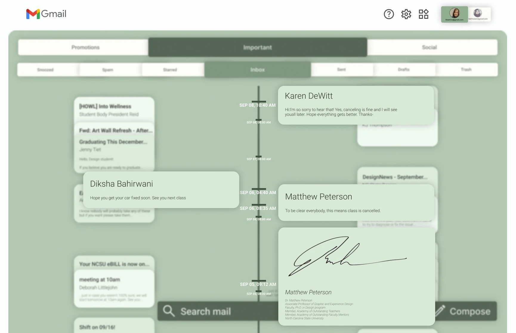
This project reimagines the gmail interface by using the structure of a tree to visually represent email chains. This tree-inspired interface allows users to easily navigate and understand the flow of the conversation, as each branch visually represents the progression and hierarchy of the dialogue. By mirroring the natural growth and complexity of a tree, this UI design provides a clear, intuitive way to manage and explore email threads, enhancing user experience through a visually organized and interconnected structure.
Individual project focused on core conceptualization of an interface
PROJECT TYPE:
1.5 week; September 2023
DURATION:
Figma
Procreate
Miro
SOFTWARE USED:
BEHAVIOR
Each individual mailbox symbolizing a unique tree allows users to effortlessly zoom in and out to transition from the expansive forest scenery to a more detailed focus of a single tree trunk.
VISUAL
Each mailbox is designed to resemble a tree, contributing to a picturesque forest-like arrangement of the entire mailbox area.
BEHAVIOR
Zooming in on a singular trunk enables users to have a focused view of a solitary mailbox. They can conveniently scroll through the timeline, with the most recent conversations elegantly displayed at the top.
VISUAL
The timeline is prominently positioned at the center, serving as the unifying element that connects all the cards to a central trunk structure.
BEHAVIOR
Hovering over an email enlarges is allowing the user to get the gist of the email without having to click on it and at the same time provides user with various actions available (archive, label, reply, etc.)
VISUAL
The Cards function as a leaf. An email thread with more than one reply will be stacked as a bunch of leaves.
BEHAVIOR
Clicking on a stack of card opens up the conversation with the user’s replies on left and other replies on the right. Hovering over each reply provides user with various action items.
VISUAL
Clicking on a stack of card resembles ruffling a stack of leaves and spreading the conversation with the user’s replies on left and other replies on the right. The user can see more micro details that are now available like specific times for each reply.
BEHAVIOR
Double-clicking on a card will elegantly flip it over, unveiling the signature of the sender akin to the graceful act of turning a leaf to discover its hidden beauty.
VISUAL
With this concept I tried to eliminate secondary options and information until necessary like action buttons and signatures at the end of the message. This gives the user immediate grasp of primary information that is the contents of the email itself.
BEHAVIOR
Dragging an email to side would delete an email.
VISUAL
Just like the simple act of plucking a leaf from a tree, a user has the ability to effortlessly remove or delete an email.


